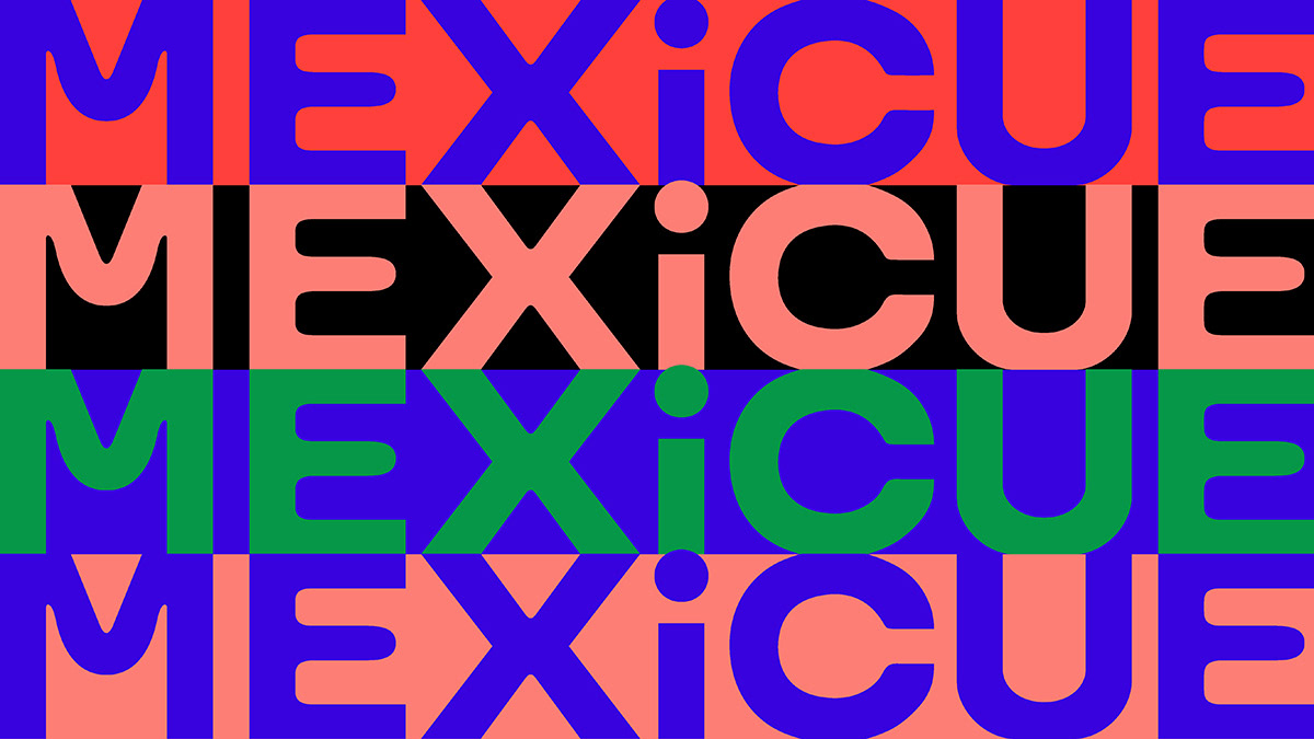
Mexicue
↳ Client: Mexicue
↳ Art Direction: Shehan Abrahams
↳ Design: Tina Touli, Izabel Zoulinaki
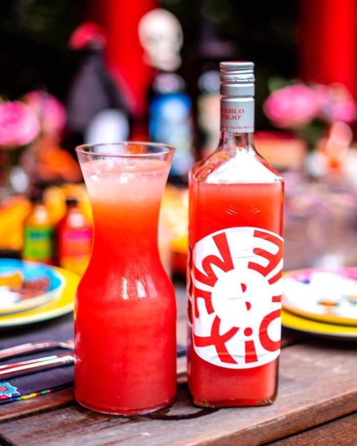
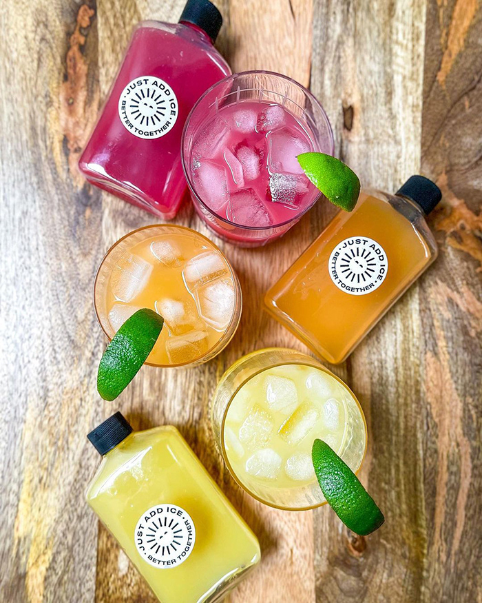
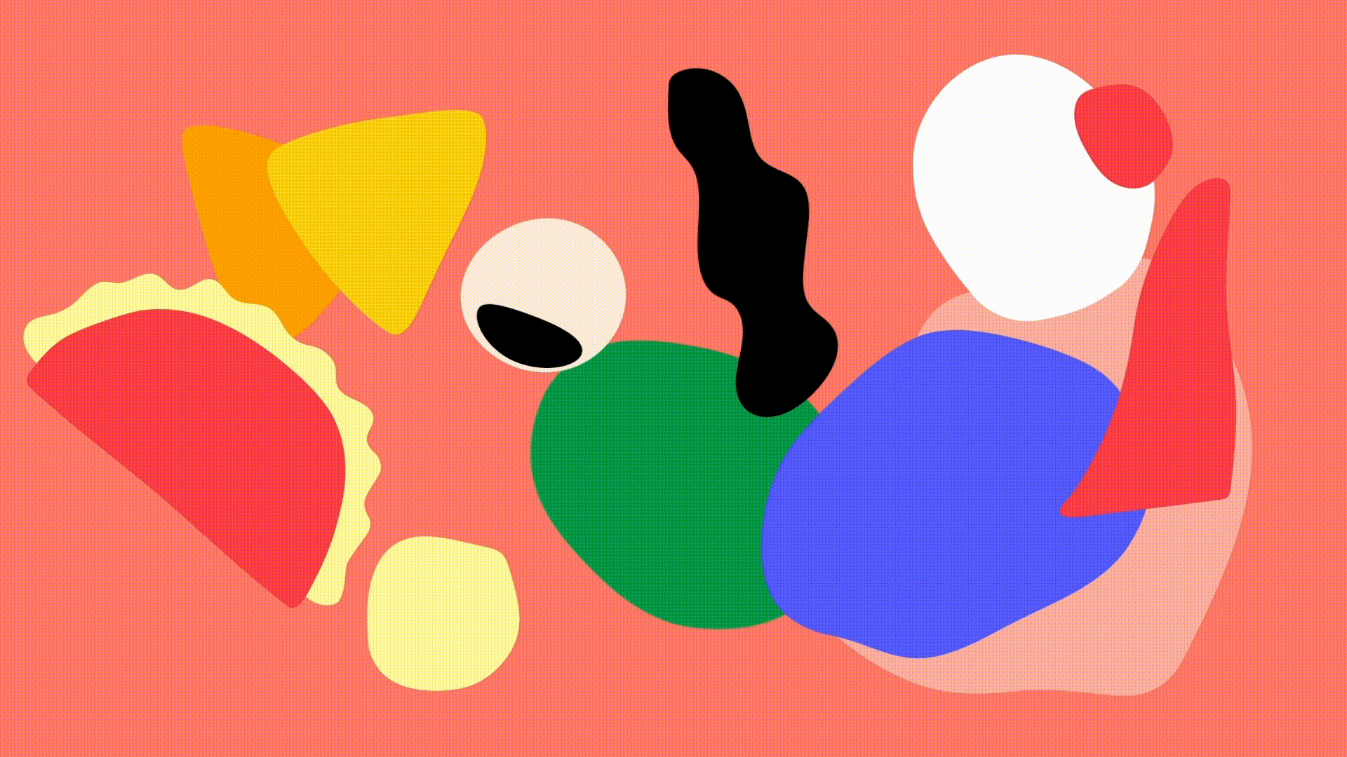
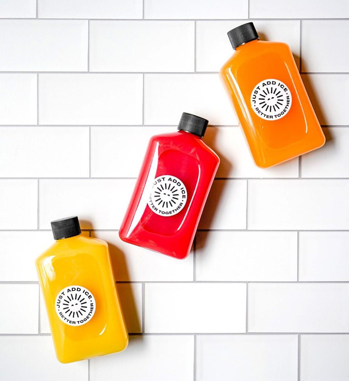
Refreshing the Mexicue brand by revisiting their main brand assets, such as their logotype, symbol, graphics and, of course, Mexican culture inspired colour palette, giving them a fresh, contemporary look.
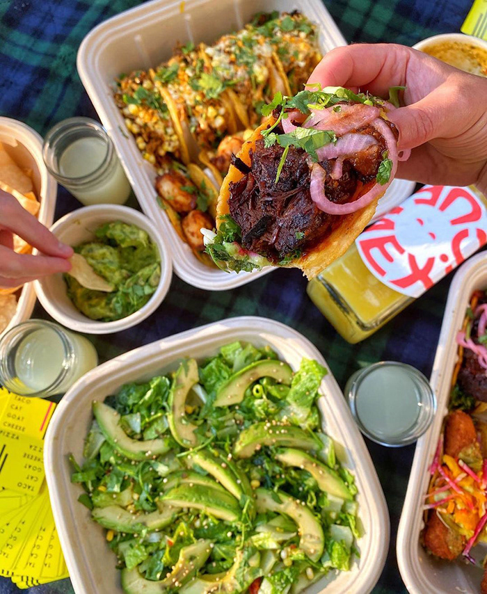
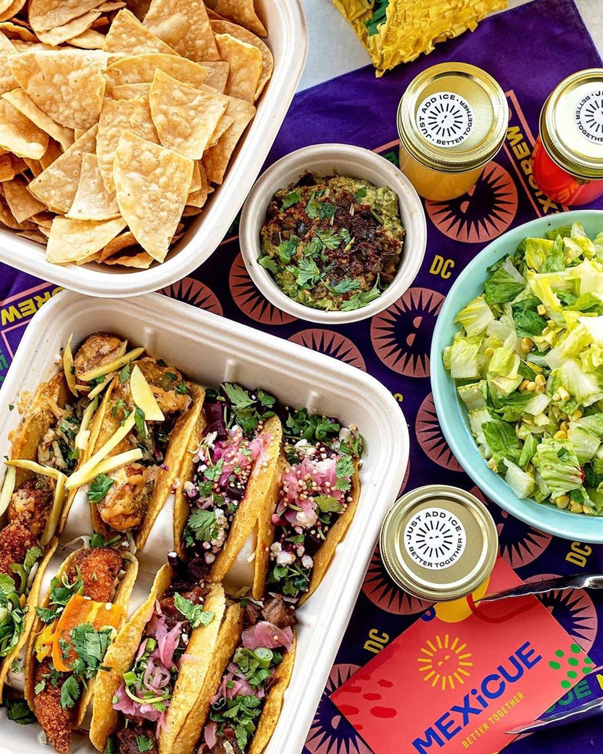
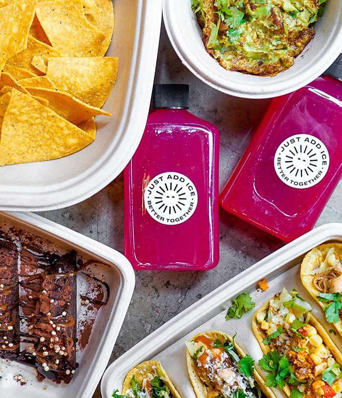
Mexicue started with a passion for real, made-from-scratch cooking in a food truck that traversed Manhattan and Brooklyn, embracing the vibrant culture of the city. From concert fans to festival goers, day-trippers to lunch-breakers, they fed them all, body and soul.
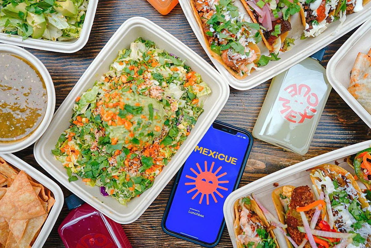
Today, Mexicue has evolved into a restaurant and lively bar scene that does things a little differently from others. Bolder. And with a lot more flavour and fun.
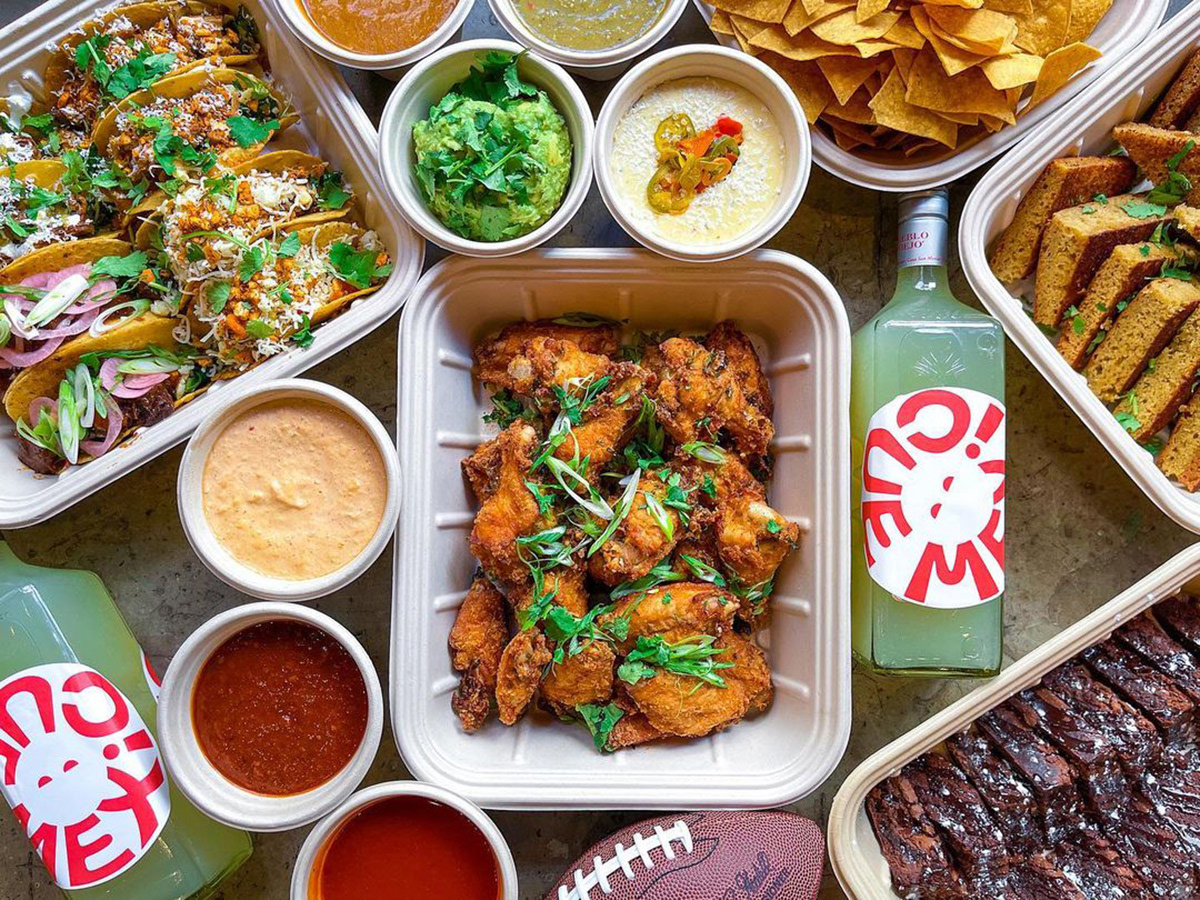
They smoke, braise, char, pickle, juice, mash, grind and create in a way that is inspired by the Mexican tradition. All with a twist of the American South. They believe in authentic, down-home cooking techniques.
Nothing fancy about it. Just good music. Strong, quality drinks. Shareable, mouth-watering food. That’s all the ingredients you need for the perfect neighbourhood escape. Created for making memories and kicking back. The ultimate place to unwind and dine, or order a round of tequila to take the night to the next level.