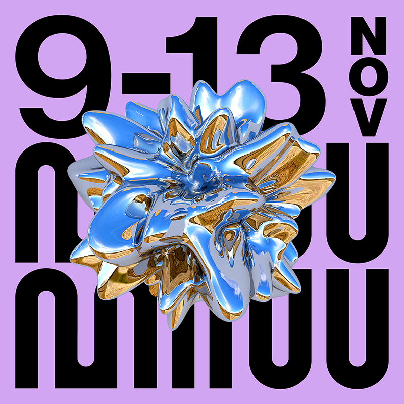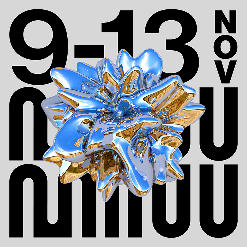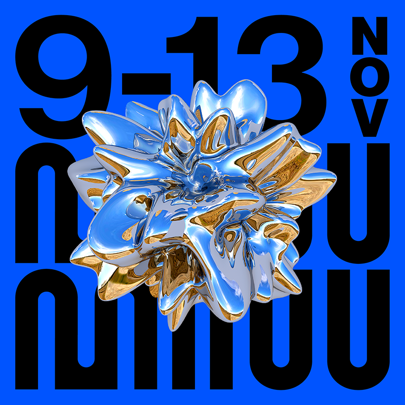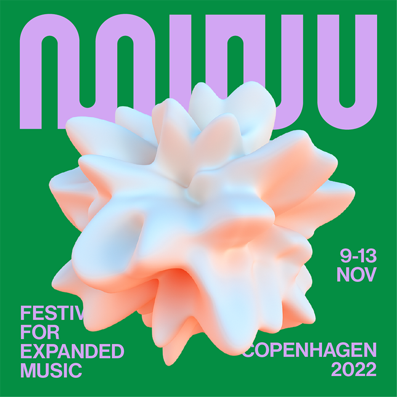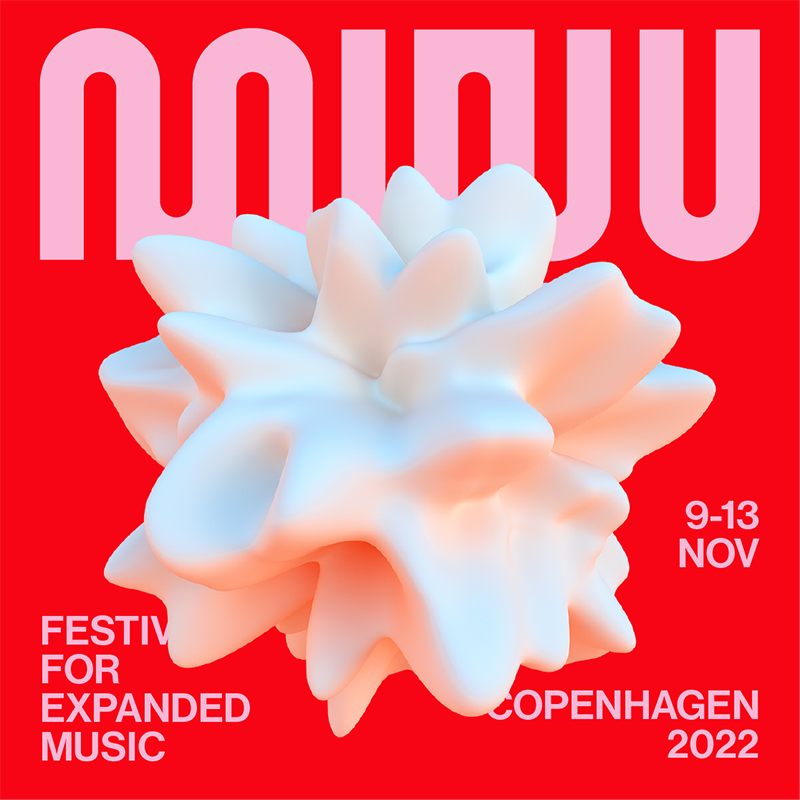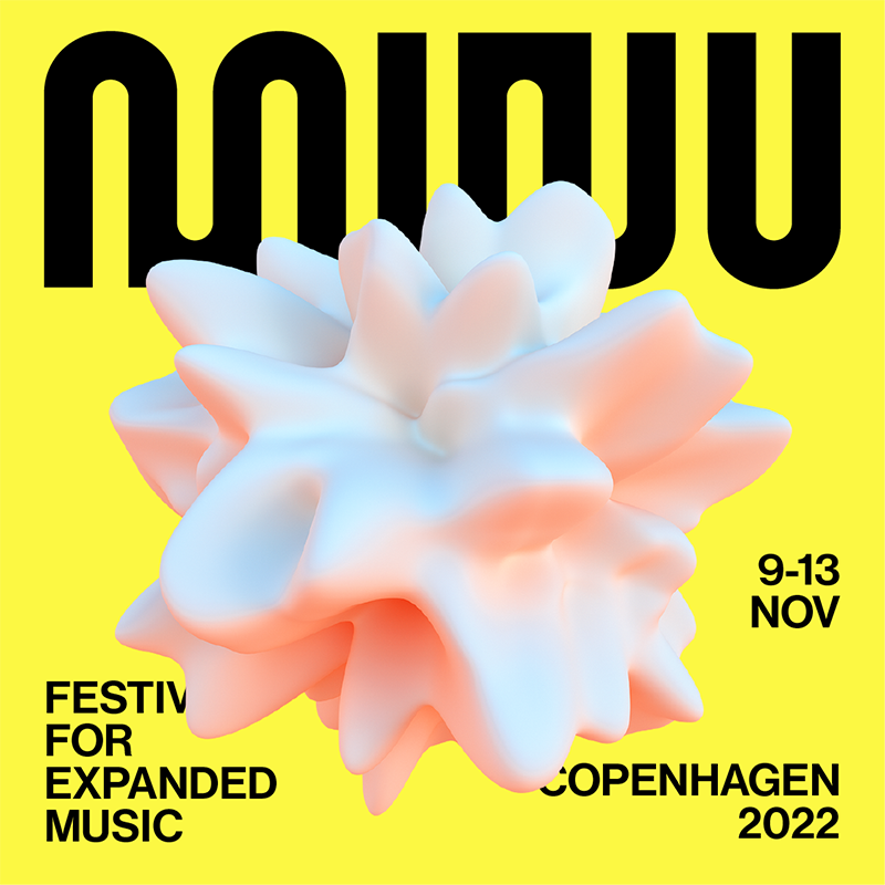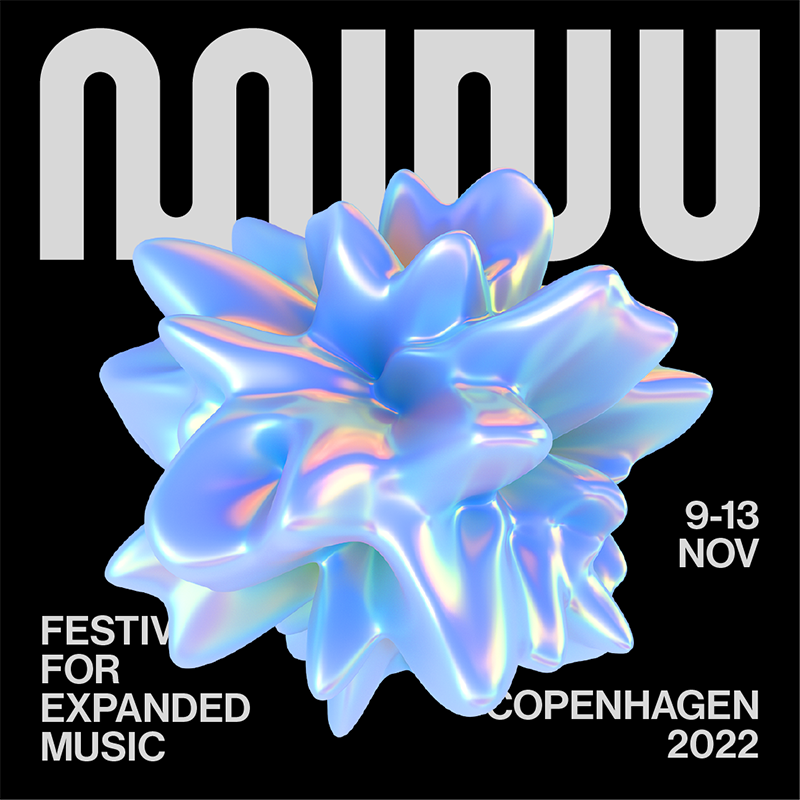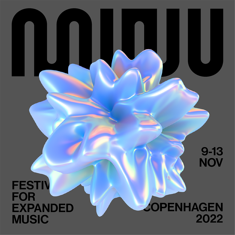
MINU
↳ Client: MINU
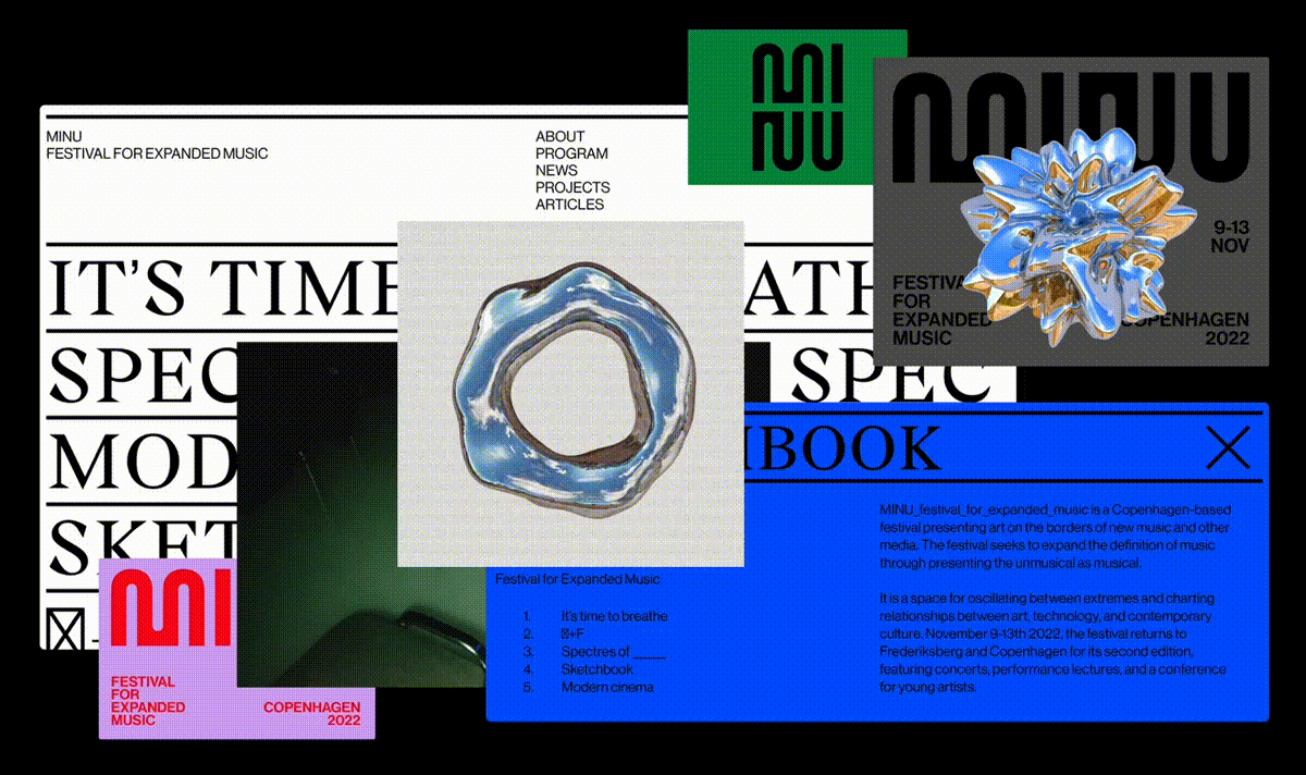
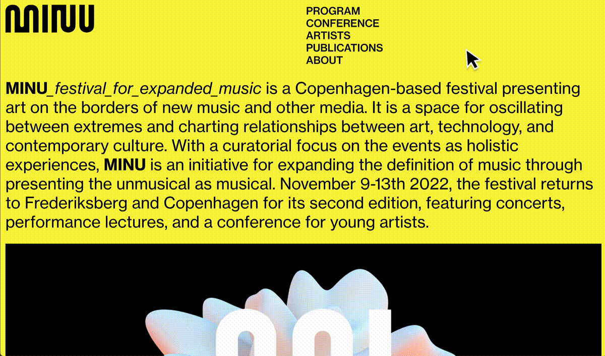
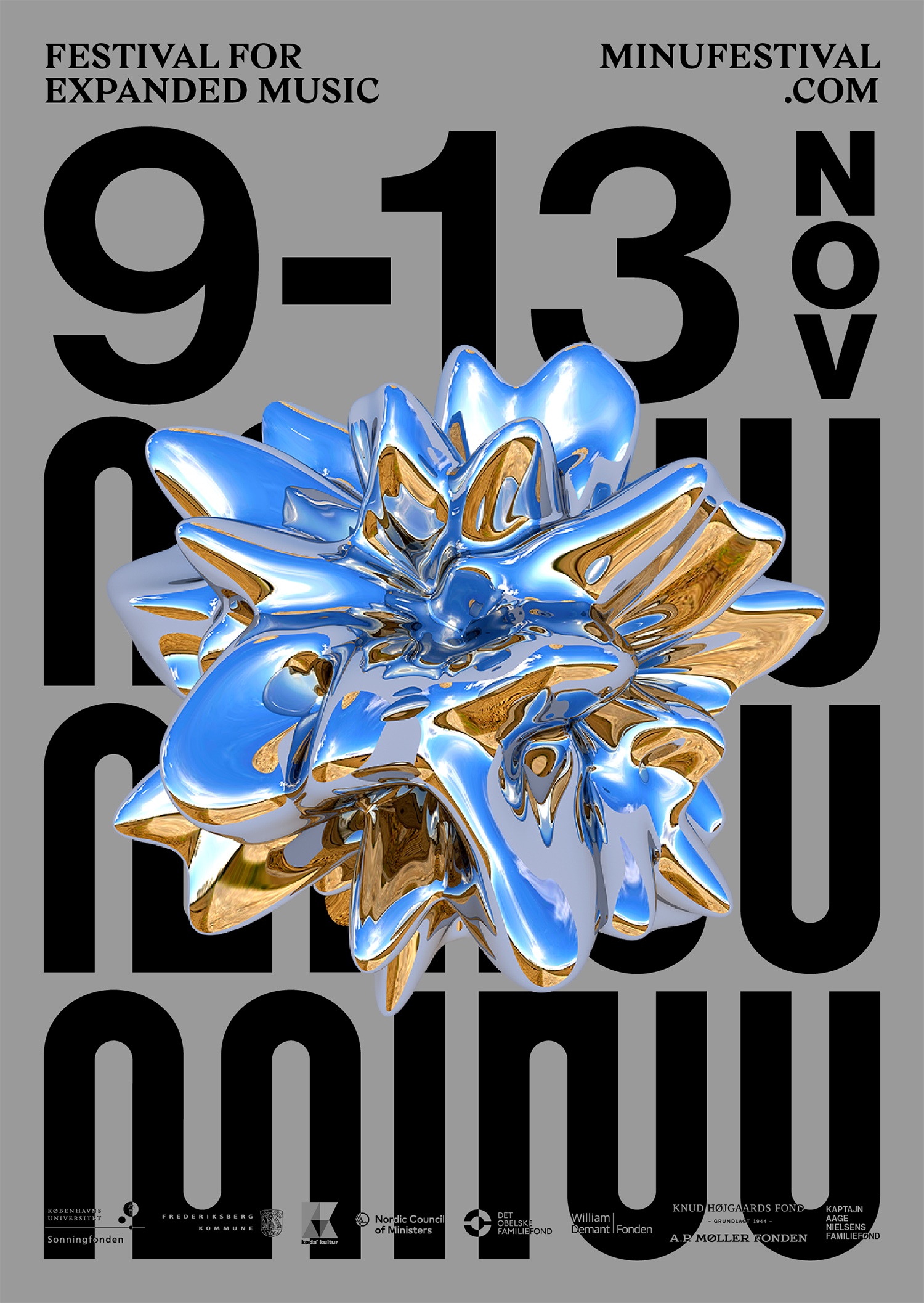
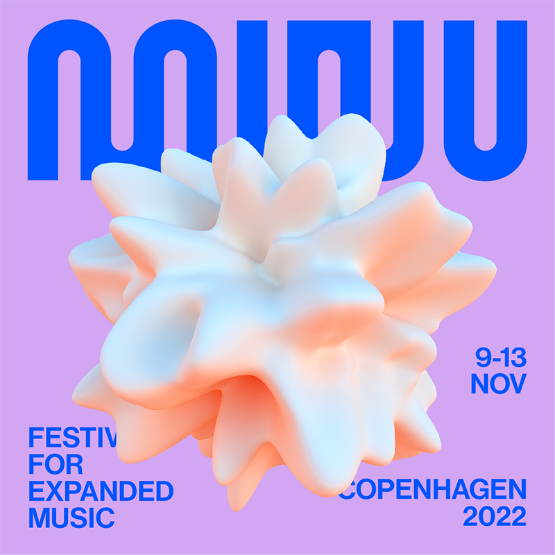
MINU, a Copenhagen-based festival for expanded music, revolves around the idea of presenting art on the borders of new music and media, testing the grounds on the way art, technology and contemporary culture intertwine.
When designing the branding, graphic design and web customisation, the focus was on building an identity that highlighted MINU’s festival ethos.
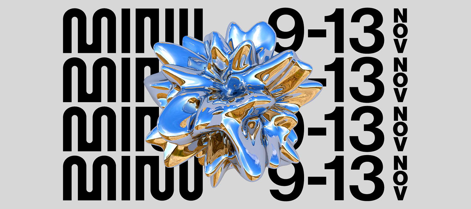
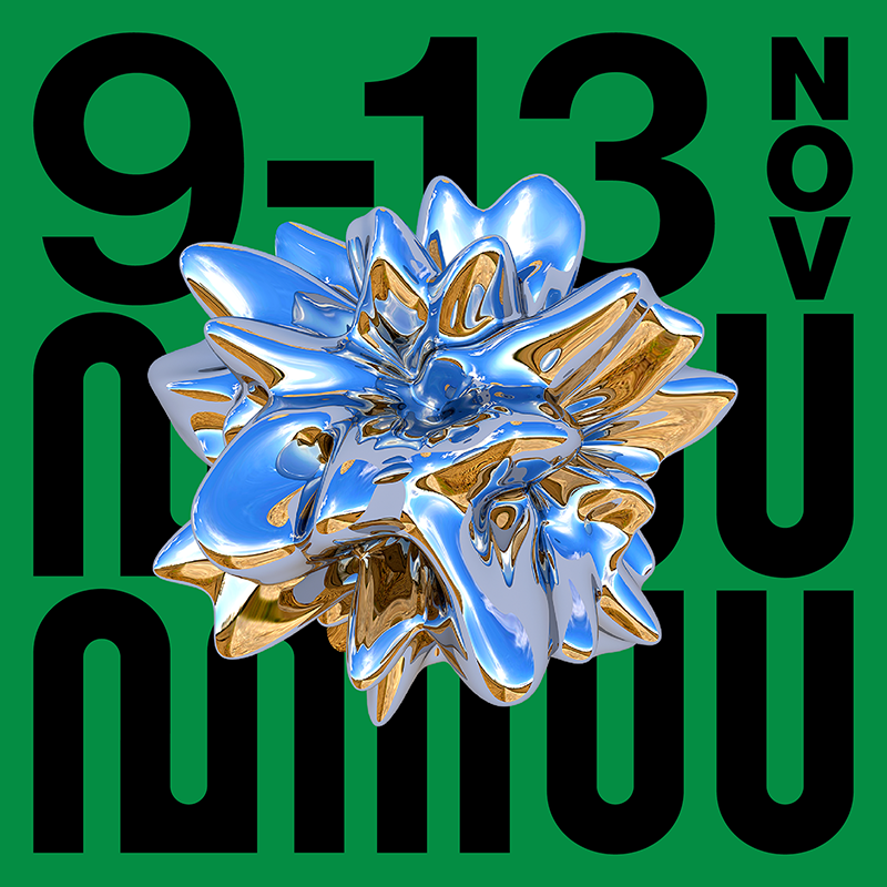
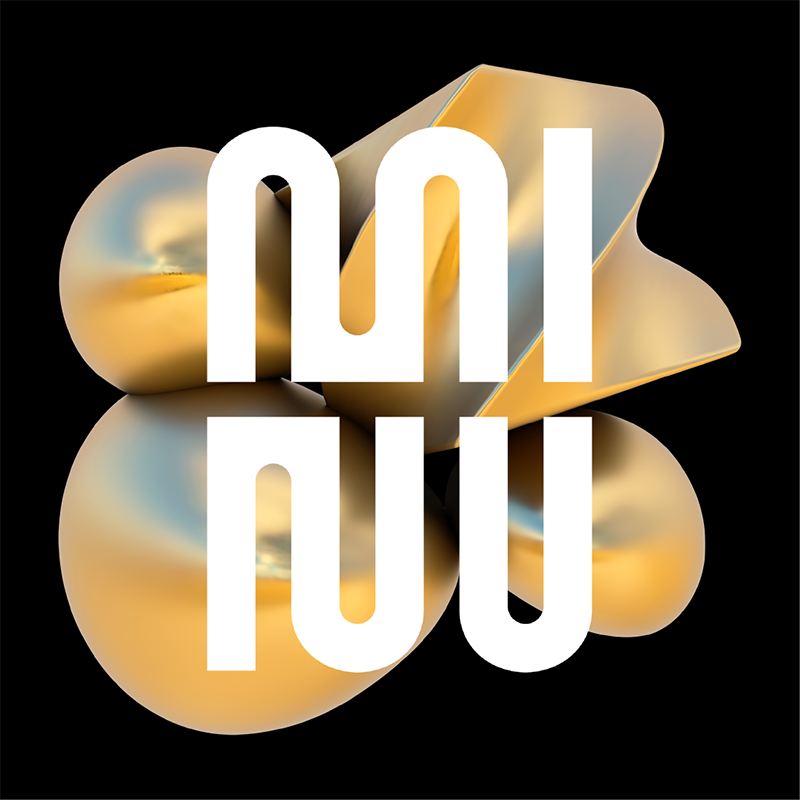
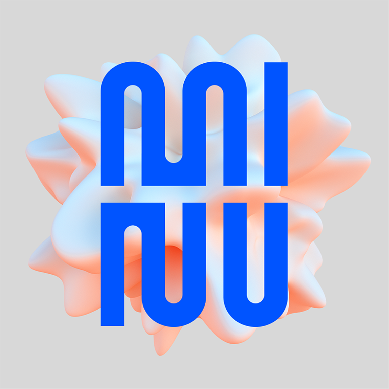
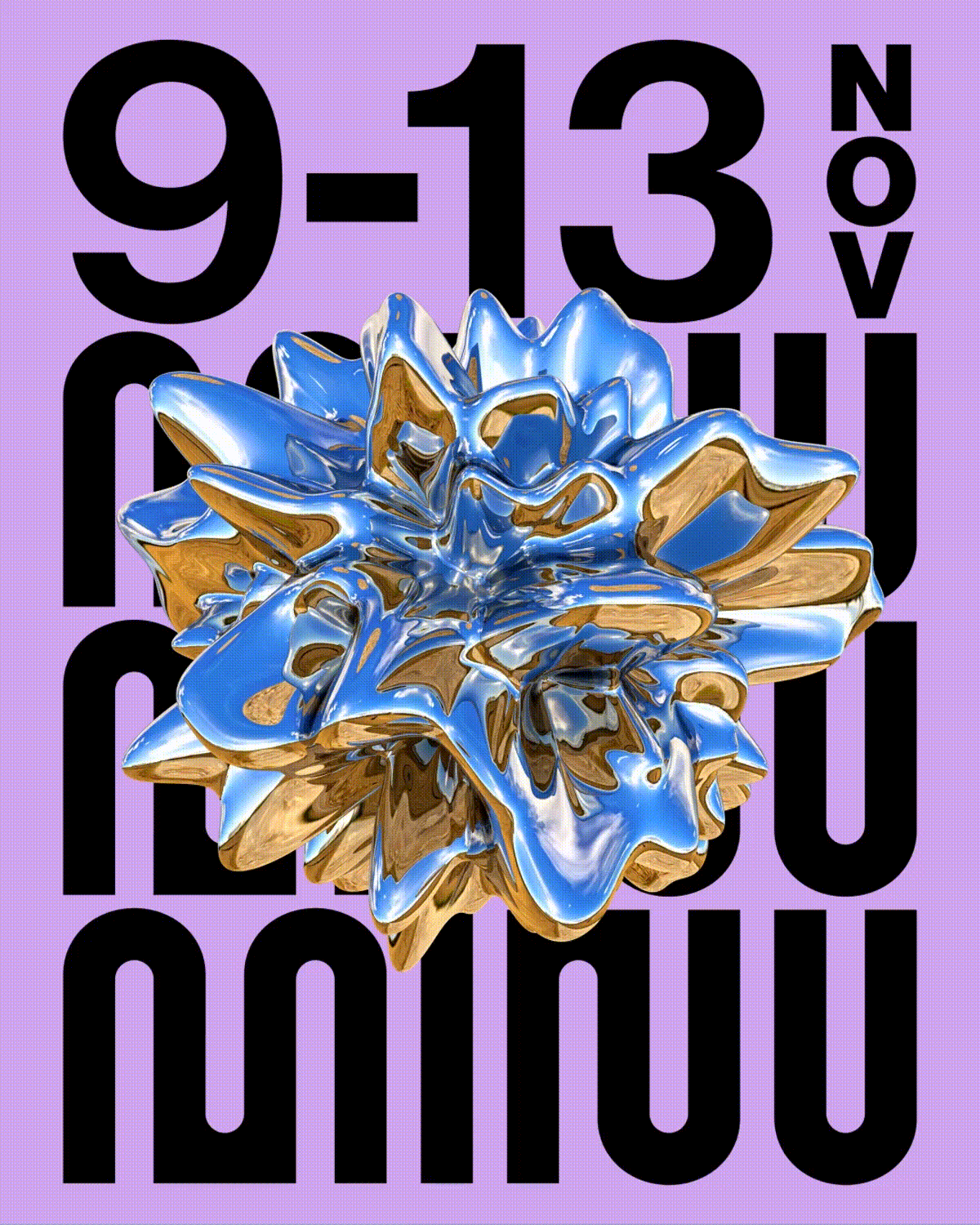
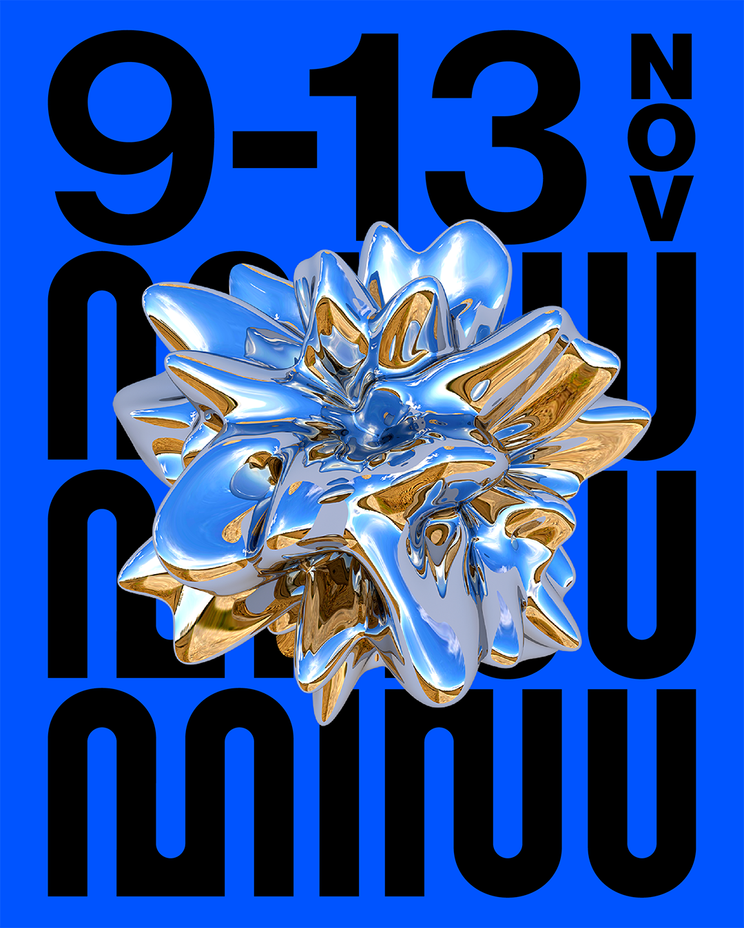
A custom typography was created for the logotype, inspired by sound waves. Abstract 3D shapes were created to give a 'distorted' feel, representing a visceral reaction to sound.
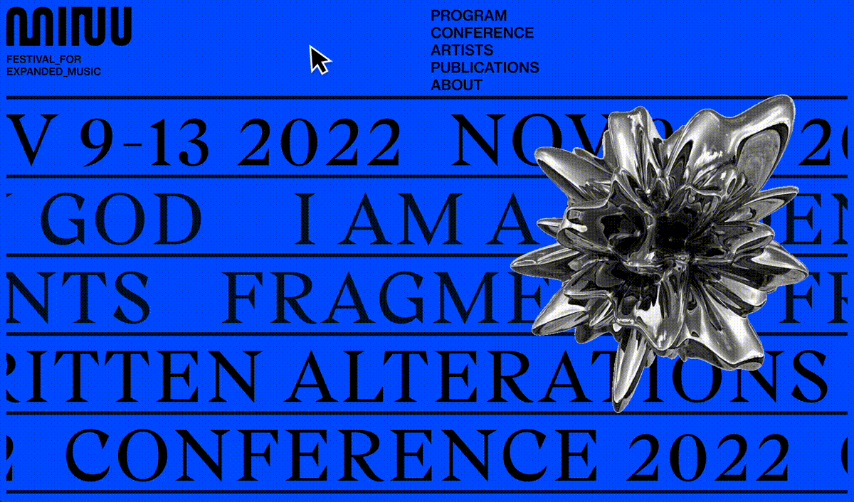
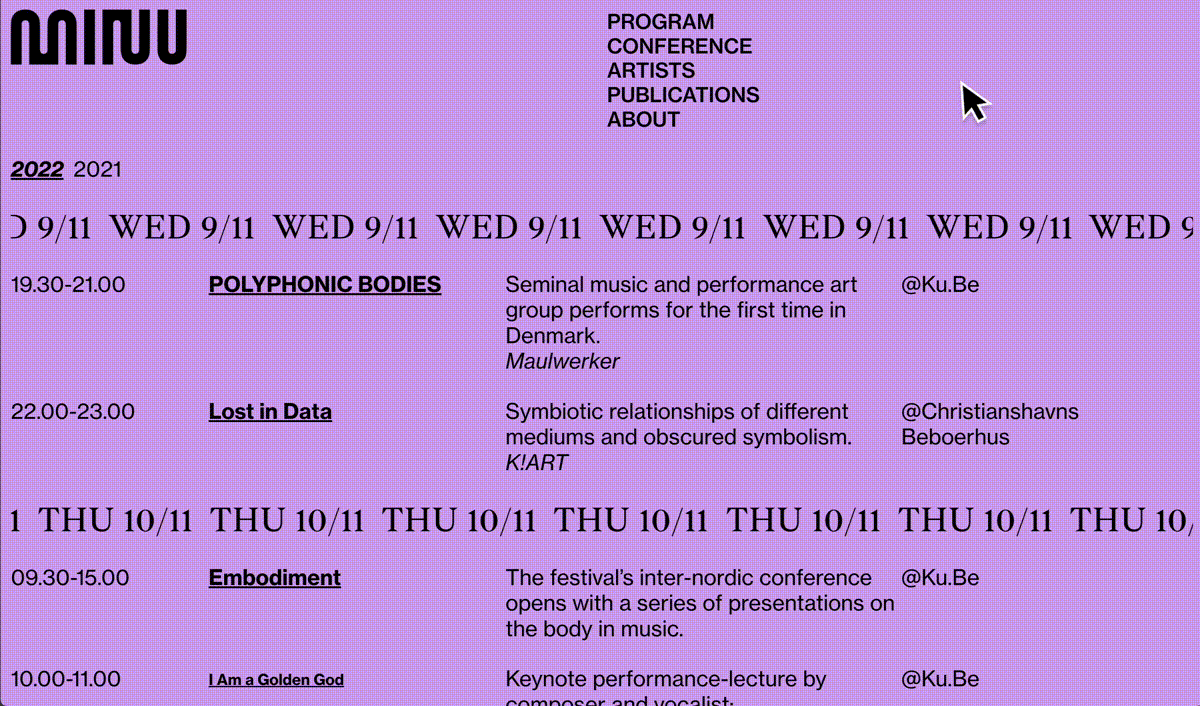
As one navigates the website, they will discover a constant motion, symbolising the overarching theme of new art genres and movements constantly evolving, changing, adapting and relationships between them shifting.
The design of the experience reflects MINU’s aim to offer a forward-thinking look and feel, and approach things from a more experimental point of view.